What is The Rule of 3 in Decorating? (How to Use it?)
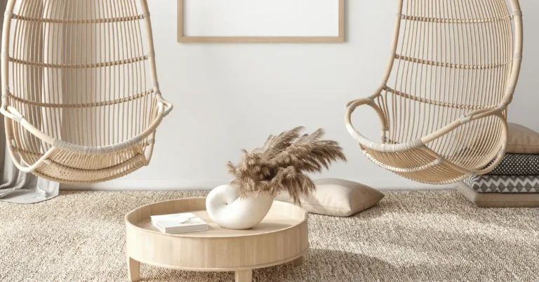
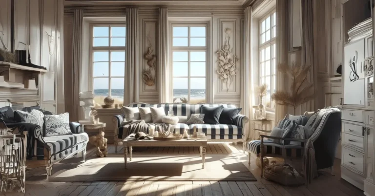
What is The Rule of 3 in Decorating? When it comes to creating a well-designed space, the Rule of 3 is a fundamental principle that can make a big impact.
This rule suggests that items arranged in odd numbers, particularly 3, create a more visually appealing and balanced look.
Whether you are styling a shelf, hanging artwork, or arranging furniture, incorporating the Rule of 3 can help you achieve a harmonious and cohesive design. By grouping items in threes, you create a sense of rhythm and repetition that is pleasing to the eye.
The Rule of 3 also applies to color schemes. Choosing three colors to work with can help create depth and interest in a room. One color should dominate, while the other two are used as accents.
Table of contents
- What is the Rule of 3 in Decorating?
- Why is the Rule of 3 Important in Interior Design?
- How Can You Apply the Rule of 3 in Your Home?
- What are Some Examples of the Rule of 3 in Decorating?
- How Does the Rule of 3 Enhance Visual Interest and Balance?
- Can the Rule of 3 be Applied to Colors and Textures?
- What are Some Exceptions to the Rule of 3 in Decorating?
- How Can You Use the Rule of 3 for Furniture Placement?
- What Impact Does the Rule of 3 Have on Room Flow and Functionality?
- How Can Understanding the Rule of 3 Improve Your Decorating Skills?
- FAQs
- Final Thoughts
What is the Rule of 3 in Decorating?
When it comes to decorating your home, you may have heard about the Rule of 3. But what exactly is it and how can it enhance the look and feel of your space? Let’s dive in!
The Rule of 3 is a design principle that suggests things arranged in odd numbers, particularly 3, are more visually appealing, memorable, and effective.
It is based on the idea that odd numbers create balance and harmony in a composition. This rule can be applied to various elements in your home, such as furniture, accessories, and artwork.
For example, when arranging decorative items on a shelf or a coffee table, grouping them in threes can create a sense of balance and visual interest.
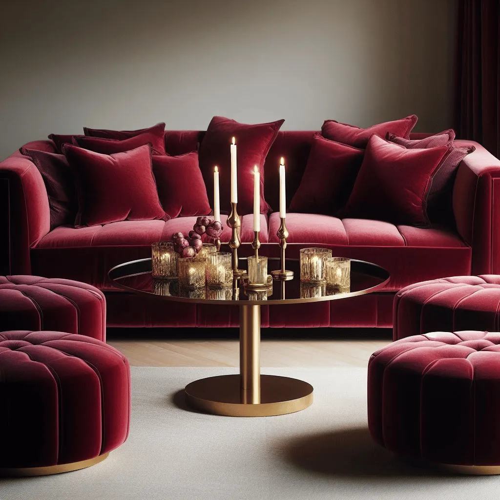
You can mix and match different sizes, shapes, and textures to add depth and dimension to the arrangement.
Similarly, when choosing artwork for your walls, consider hanging three pieces in a row or creating a gallery wall with an odd number of frames.
The Rule of 3 also applies to color schemes. When selecting colors for a room, using a triadic color scheme, which involves three colors evenly spaced on the color wheel, can create a harmonious and visually pleasing palette.
This can be achieved by choosing a dominant color, a secondary color, and an accent color.
Remember, the Rule of 3 is not a strict rule that must be followed in every situation. It is a guideline that can help you achieve balance and visual interest in your home. Feel free to experiment and trust your instincts when it comes to decorating!
Why is the Rule of 3 Important in Interior Design?
When it comes to interior design, there are certain principles that can make a big difference in creating a visually appealing space. One such principle is the Rule of 3.
This rule states that things arranged in odd numbers, particularly in groups of three, are more visually appealing and memorable than even-numbered arrangements.
But why is the Rule of 3 important in interior design? Well, it all comes down to balance, harmony, and creating a focal point.
By grouping items in threes, you create a sense of balance and symmetry in the space. This can be achieved through various elements such as furniture, accessories, or even colors.
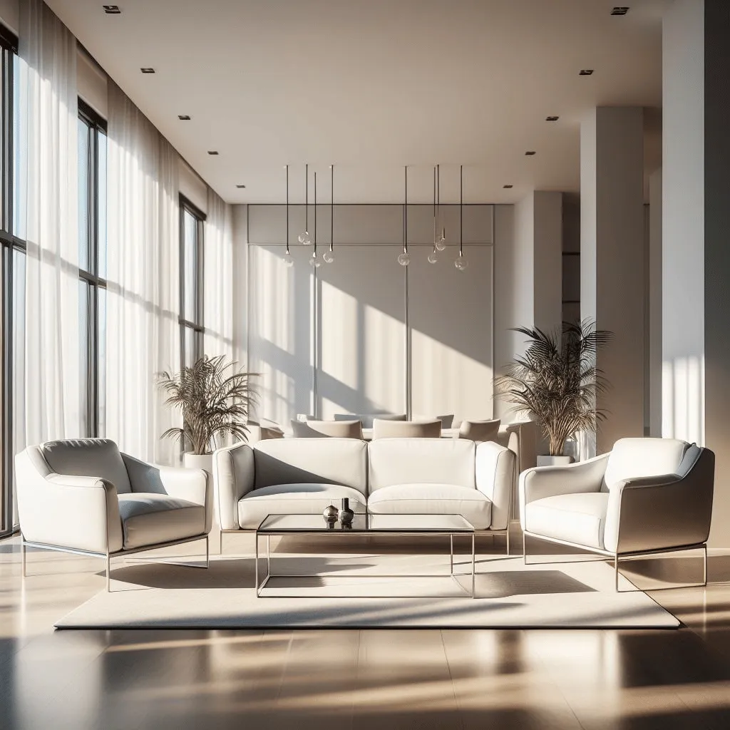
For example, imagine a living room with a sofa, two chairs, and a coffee table. By placing the chairs on either side of the sofa and adding a coffee table in the center, you create a visually pleasing arrangement that follows the Rule of 3.
This not only creates balance but also provides a focal point for the room.
Additionally, the Rule of 3 helps to create visual interest and prevent monotony. When items are arranged in odd numbers, they create a sense of movement and variety. This can be achieved through different sizes, shapes, or textures of objects.
So, whether you’re arranging decorative objects on a shelf, selecting artwork for a gallery wall, or choosing colors for a room, remember the Rule of 3.
It’s a simple yet powerful principle that can transform any space into a visually appealing and harmonious environment.
How Can You Apply the Rule of 3 in Your Home?
Have you ever heard of the Rule of 3? It’s a design principle that suggests grouping items in threes to create balance and visual interest.
But did you know that you can also apply this rule to transform your home? Whether you’re redecorating a room or simply looking to freshen up your space, incorporating the Rule of 3 can make a big impact.
One way to apply the Rule of 3 is through color. Choose three colors that complement each other and use them throughout your home.
For example, you could have a neutral base color, a bold accent color, and a softer secondary color. This will create a cohesive look and tie all the rooms together.
Another way to apply the Rule of 3 is through furniture placement. Instead of pushing all your furniture against the walls, try creating three distinct areas within a room.

For example, you could have a seating area, a reading nook, and a workspace. This will make the room feel more inviting and functional.
Lastly, consider using the Rule of 3 when it comes to decor. Instead of cluttering your shelves with lots of small items, choose three larger statement pieces.
This will create a focal point and draw the eye. You can also use the Rule of 3 when arranging artwork on the walls. Group three pieces together to create a gallery-style display.
So, the next time you’re looking to update your home, remember the Rule of 3. Whether it’s through color, furniture placement, or decor, incorporating this design principle can help you create a space that is both visually appealing and functional.
What are Some Examples of the Rule of 3 in Decorating?
Have you ever wondered why some interior designs look effortlessly stylish and visually appealing? The secret lies in the rule of 3 in decorating.
This design principle has been used for centuries to create balance, harmony, and visual interest in a space.
The rule of 3 is based on the idea that odd numbers are more visually appealing and memorable than even numbers. When applied to decorating, it involves grouping elements in threes to create a cohesive and balanced look.
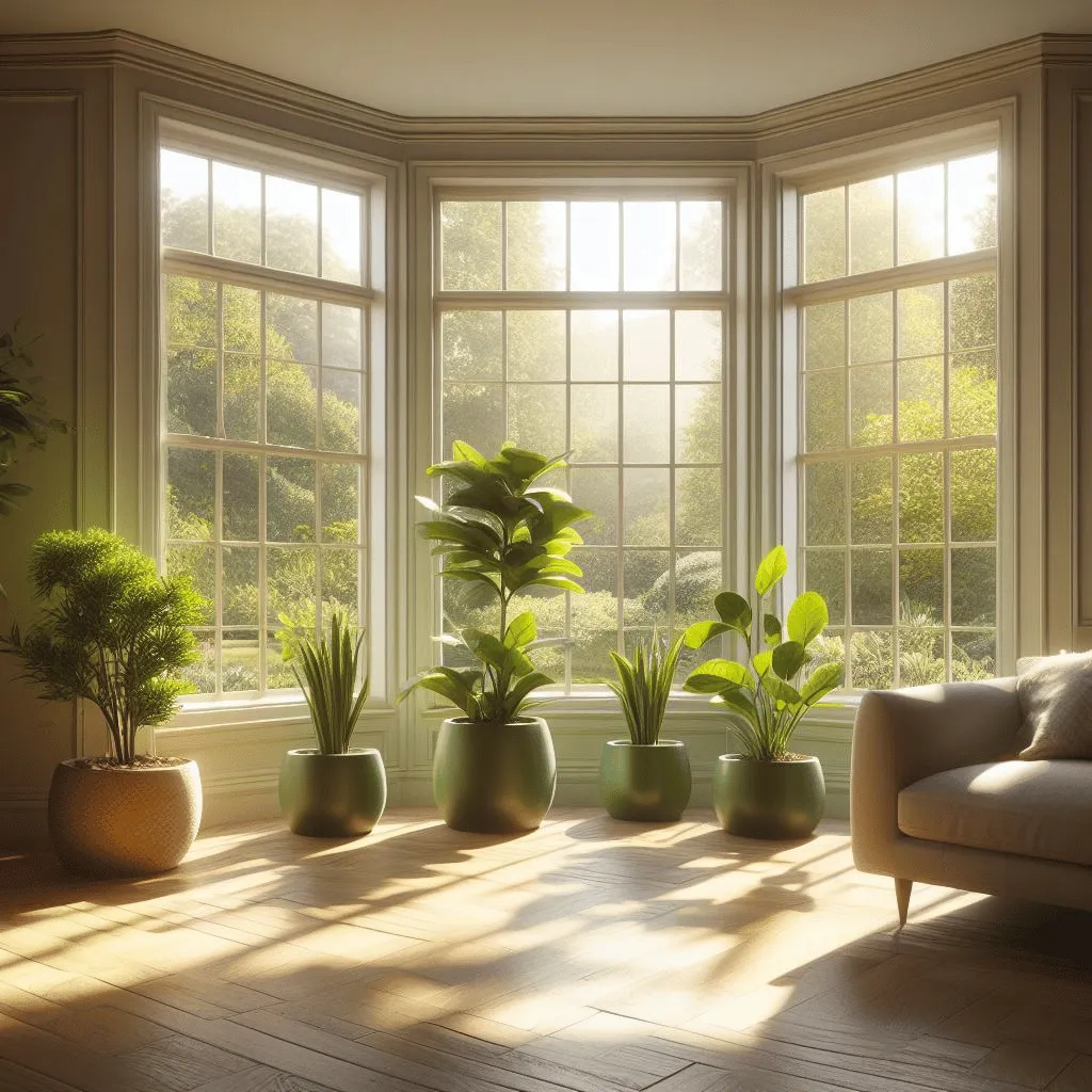
Here are some examples of how you can apply the rule of 3 in your own home:
- Gallery Wall: Create a stunning gallery wall by hanging three art pieces of different sizes and shapes. The varying heights and widths will add depth and dimension to your wall.
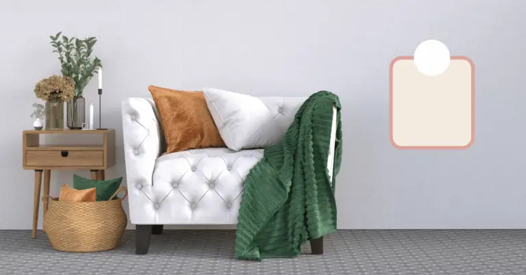
- Accent Pillows: Place three accent pillows on your sofa or bed, using different patterns or textures. This will add visual interest and create a focal point in the room.
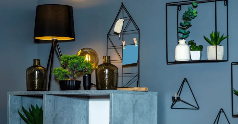
- Tabletop Decor: Arrange three decorative objects of varying heights on a coffee table or console table. This will create a visually pleasing vignette.
Remember, the key to successfully using the rule of 3 is to create a sense of balance. Make sure the elements you choose are visually related and complement each other.
How Does the Rule of 3 Enhance Visual Interest and Balance?
Have you ever wondered why some designs just seem to catch your eye and hold your attention? It could be because they follow the rule of 3, a powerful principle in design that enhances visual interest and balance.
The rule of 3 is based on the idea that things that come in threes are inherently more appealing and memorable.
Our brains are wired to find patterns and symmetry, and the rule of 3 provides just that. By grouping elements in threes, designers create a sense of harmony and completeness.
When it comes to composition, the rule of 3 can be applied in various ways. For example, in photography, the rule of thirds is a popular technique where the frame is divided into three equal parts vertically and horizontally.

By placing the main subject at the intersection points, photographers can create a more visually pleasing image.
In graphic design, the rule of 3 can be used to create balance and hierarchy. By grouping elements into three distinct sections, designers can guide the viewer’s eye and create a sense of order.
This can be particularly effective in web design, where the rule of 3 can be used to structure the layout and prioritize content.
Next time you’re designing something, whether it’s a website, a flyer, or even a social media post, consider incorporating the rule of 3.
Experiment with grouping elements in threes and see how it enhances the visual interest and balance of your design. You’ll be amazed at the difference it can make!
Can the Rule of 3 be Applied to Colors and Textures?
When it comes to design, the Rule of 3 is a well-known principle that suggests that things arranged in groups of 3 tend to be more visually appealing and memorable. But can this rule also be applied to colors and textures?
The answer is a resounding yes! Just like with other design elements, using the Rule of 3 can greatly enhance the visual impact of colors and textures in your designs.
When selecting colors, choosing a triadic color scheme can create a harmonious and balanced look. This involves selecting three colors that are equidistant from each other on the color wheel.
By using three colors, you can create contrast and interest while maintaining a cohesive and pleasing color palette.

Similarly, the Rule of 3 can be applied to textures. Mixing three different textures in a design can add depth and dimension. For example, combining a smooth surface with a rough one and a textured one can create a visually interesting composition.
Remember, the Rule of 3 is a guideline, not a strict rule. Feel free to experiment and adjust as needed to achieve the desired effect.
By applying the Rule of 3 to colors and textures, you can create visually stunning designs that are sure to leave a lasting impression.
What are Some Exceptions to the Rule of 3 in Decorating?
When it comes to decorating, the rule of 3 is a well-known guideline that suggests grouping items in threes for a balanced and visually appealing look.
However, there are times when breaking this rule can actually enhance your decor. Here are some exceptions to keep in mind:
1. Odd numbers
While the rule of 3 is popular, odd numbers in general can create an interesting and dynamic display. Consider using 5 or 7 items instead of 3 to add more visual interest.

2. Different sizes
Instead of sticking to the same size for each item in a group, mix it up! Varying the sizes of objects can create depth and dimension in your decor.
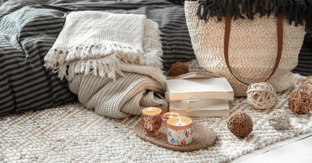
3. Asymmetry
Breaking away from the symmetrical arrangement can add a touch of uniqueness to your space. Try placing items in an asymmetrical pattern to create a more eclectic and personalized look.

Remember, rules are meant to be broken! While the rule of 3 is a great starting point, don’t be afraid to experiment and find what works best for your own style and space.
How Can You Use the Rule of 3 for Furniture Placement?
When it comes to arranging furniture in your home, following a few simple principles can make a world of difference in the overall look and feel of your space. One such principle is the Rule of 3, which can help you create a balanced and visually appealing layout.
The Rule of 3 is a design concept that suggests grouping furniture and decor items in sets of three. This arrangement creates a sense of harmony and balance in a room, making it more visually appealing and inviting.
So, how can you use the Rule of 3 for furniture placement? Here are a few tips:
- Create focal points: Use three key pieces of furniture to create a focal point in a room. For example, in a living room, you can arrange a sofa, a coffee table, and an accent chair in a triangle formation to draw attention to the seating area.
- Vary heights and sizes: When arranging furniture, consider the height and size of each piece. Aim for a mix of heights and sizes to create visual interest. For instance, you can place a tall bookshelf, a medium-sized side table, and a low ottoman together to add dimension to a room.
- Distribute visual weight: The Rule of 3 can help you distribute visual weight evenly throughout a space. By placing three items of similar visual weight on one side of a room, you can balance out a larger piece of furniture on the opposite side.

Remember, the Rule of 3 is a guideline, not a strict rule. Feel free to experiment and adjust as needed to suit your personal style and the layout of your space.
By incorporating this design principle into your furniture placement, you can create a well-balanced and visually pleasing environment that will make you feel right at home.
What Impact Does the Rule of 3 Have on Room Flow and Functionality?
Have you ever wondered why some rooms feel more inviting and functional than others? The secret lies in the Rule of 3. This design principle has been used for centuries to create harmonious and balanced spaces.
The Rule of 3 states that objects arranged in odd numbers are more visually appealing and memorable. When applied to room design, it can greatly impact the flow and functionality of the space.
Firstly, the Rule of 3 helps to create a focal point in a room. By arranging three key elements, such as a sofa, coffee table, and artwork, in a triangular formation, you draw the eye towards the center and create a sense of balance.

Secondly, the Rule of 3 can guide the placement of furniture and accessories. Instead of cluttering a room with too many items, focus on three essential pieces that serve a purpose. For example, in a living room, you could have a sofa, armchair, and side table.
Lastly, the Rule of 3 encourages movement and flow within a room. By leaving enough space between each element, you allow for easy navigation and prevent the space from feeling cramped.
How Can Understanding the Rule of 3 Improve Your Decorating Skills?
Have you ever wondered why some interior designs look effortlessly stylish and visually appealing? The secret lies in understanding the Rule of 3. This design principle has been used for centuries and can greatly enhance your decorating skills.
The Rule of 3 is based on the idea that things arranged in odd numbers are more visually appealing and memorable. When applied to decorating, this principle helps create balance, harmony, and visual interest in a space.
So how can understanding the Rule of 3 improve your decorating skills? Here are a few ways:
Creating focal points: By grouping three items together, you can create a focal point that draws attention and adds visual impact to a room.
Whether it’s a trio of artwork on a wall or a cluster of decorative objects on a shelf, the Rule of 3 helps create a sense of unity and purpose.
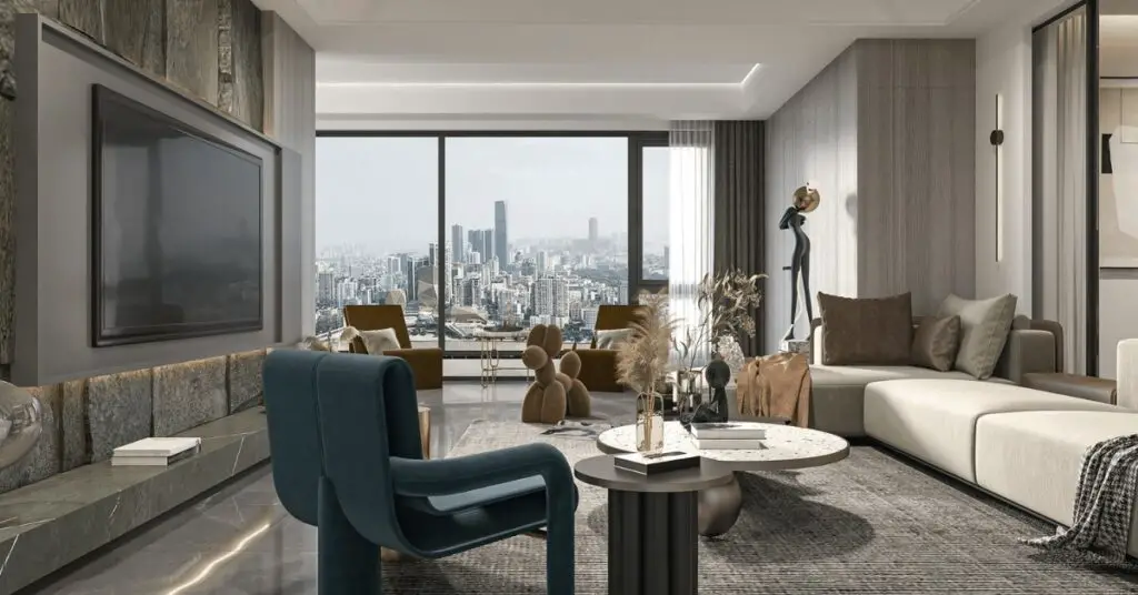
Adding depth and dimension: Using the Rule of 3 allows you to play with different heights, sizes, and textures.
By incorporating three different elements, such as a tall vase, a medium-sized sculpture, and a small plant, you can add depth and dimension to a space, making it more visually interesting.
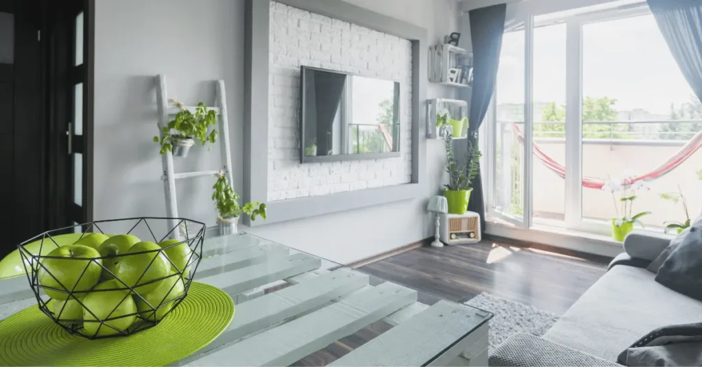
Enhancing color schemes: The Rule of 3 can also be applied to color schemes. By selecting three colors that work well together, you can create a cohesive and balanced palette.
For example, you could choose a dominant color, a secondary color, and an accent color to bring harmony and visual interest to a room.

By understanding and applying the Rule of 3, you can transform your decorating skills and create spaces that are visually appealing, balanced, and memorable.
So the next time you’re working on a design project, remember the power of the Rule of 3 and watch your decorating skills soar!
FAQs
The Rule of 3 is a design principle that suggests grouping items in threes to create balance and visual interest. It is based on the idea that odd numbers are more appealing to the eye than even numbers.
You can apply the Rule of 3 in various ways. For example, you can use three different-sized vases on a shelf, hang a trio of artwork on a wall, or style a coffee table with three decorative objects.
The Rule of 3 creates a sense of rhythm and movement in your decor. It adds depth and dimension to your space, making it more visually appealing.
Absolutely! The Rule of 3 is versatile and can be applied to any design style, whether it’s modern, traditional, eclectic, or minimalist.
While the Rule of 3 is a great guideline, it’s not a strict rule. Feel free to experiment and adjust the number of items based on your personal preference and the size of your space.
Final Thoughts
The Rule of 3 is a simple yet effective principle that can elevate your home decor. By grouping items in threes, you can create balance, harmony, and visual interest in your space.
So, go ahead and apply the Rule of 3 in your next decorating project!
Read More:

